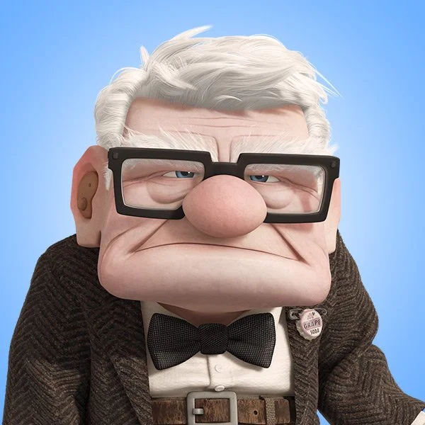
in Animation
Character Design

Characters easily recognized are often also the ones most successful—take, for example, the three intersecting circles that evoke a certain round-eared rodent (and also a lawsuit).
But what is considered when designing such characters?

Shape
One of the basic principles of art is that everything can be broken down into constituent simple shapes: circles, squares, and all the other shapes you learn in elementary school geometry.
People—stylized or not—are no different. Take, for example, Carl Fredricksen from Up.
He’s clearly a person, but we can also find a major reoccurring shape in his design.
Pixar | animation
Pixar | animation
(red rectangles added by me)
He’s overwhelmingly blocky—we can find squares and rectangles in his face shape, glasses, and overall body shape. And from this, we can find insight into his characterization: firmly grounded and “resistant to change”, as the Pixar designers themselves describe him.
With shapes, we can reflect the character’s personality onto their appearance. Which character would be more fierce: one who’s more circular, or one who’s more angular? We can also find an example of this in Pixar’s Up.
Pixar | animation
versus
Pixar | animation

Color
Like shape, color also impacts characters. Once again, Pixar gives us a (very literal) example with Inside Out.
Pixar | animation
A yellow Joy, blue Sadness, and green Disgust make sense. We associate colors with certain major concepts: red with love and anger, blue with melancholy, black with despair, and so on. Thus, we also have to consider them when designing a character. For example, if your character controls fire, it wouldn’t make much sense for them to be blue-themed (unless it was relevant to the characterization).
Web Page Design by JOYCE MA


